
The most effective way for website owners to meet the challenge of multiple devices is to treat them as integral parts of the same experience. The practice of Responsive Web Design (RWD), which was first outlined by Ethan Marcotte in 2010, allows single sites to be produced that are not only more flexible, but more adaptive to the media that renders them, elegantly restructuring in response to the constraints imposed by the user’s device of choice.
‘Mobile First’
Luke Wroblewski’s ‘Mobile First’ philosophy prioritises the mobile context to maximise focus on core content and functionality at the lowest common denominator. The mobile environment is by far the most limited in terms of real estate, usability, and connectivity and by tackling this environment first mobile users can be provided with an effective experience that enables them to access the information they need or find the solution to their problem easily and in any situation.
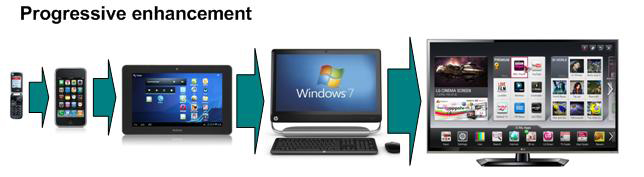
Scaling up, or ‘progressive enhancement’, from the mobile context is much easier than scaling down from the desktop. Message, content and functionality will remain intact as screen real estate and connection speed increase. Scaling down, or ‘graceful degradation’, can be done (and indeed may be the only option available, especially when dealing with legacy sites running in production) but this significantly increases the chances of core messaging and functionality getting lost.
Setting viewports and media queries
Mobile browsers render websites in a ‘viewport’ that has a virtual screen width of around 900 pixels requiring users to ‘pinch and zoom’ in order to navigate. Placing a <meta name="viewport"> tag in the HTML <head> section sets a ‘normalised’ viewport that uses actual mobile screen dimensions:
<meta name="viewport" content="width=device-width, initial-scale=1, maximum-scale=5">
Setting the width property to ‘device-width’ instructs the device to use the device native screen width instead of virtual screen width and setting the scale values to 1 and 5 allows the user still to zoom in if required.
CSS3 media queries can then be used to selectively load CSS stylesheets according to device, device resolution or screen size:
<link rel="stylesheet" type="text/css" media="screen and (max-device-width: 960px)"href="basicstylesheet.css"/>
The ‘media’ property values trigger the appropriate stylesheet. If the device fits the conditions, the stylesheet specified in the ‘href’ tag is used. If not, the whole line of code is ignored.
As well as incorporating media queries in links they can also be included in the CSS either as part of an @media rule or as part of an @import directive to the same effect.
A core stylesheet should be created to cover common elements with additional stylesheets for each identified screen size, or ‘breakpoint’. Rather than simply replacing the core stylesheet, these alternative stylesheets should augment the core set with the style changes needed at each size. There is no perfect set of breakpoints but the defaults are generally thought to be:
max-width: 1024px (styles for narrow desktop browsers and iPad landscape)
max-width: 768px (styles for narrower desktop browsers and iPad portrait)
max-width: 480px (styles for iPhone/Android landscape)
max-width: 320px (styles for iPhone/Android portrait)
max-width: 240px (styles for smaller devices)

Feature detection and fallbacks
Media queries should always be complemented by a feature detection and adaptation strategy. Media queries detect screen size and serve “size appropriate” style sheets and behaviours. Feature detection clarifies the actual capabilities of the browser.
HTML5 enables a number of new features, such as canvas, geolocation and offline storage, but these features are not yet universally supported. Interrogating the Document Object Model (DOM) - a collection of objects that represent the HTML elements on the page that is constructed by the browser when a web page is rendered - will discover which features are supported based on the unique properties certain objects have in those browsers that support HTML5 features.
JavaScript frameworks like Modernizr, jQuery, and jQuery Mobile can be deployed to test browser support for HTML5 features and initiate fallbacks to suit the end user’s device. Alternatively, these checks can be written directly into the HTML.
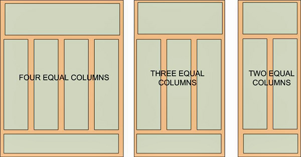
Fluid grids
Fluid grids allow the creation of percentage or ‘em’ based responsive designs which suit dynamic screen sizes. Rather than designing inside fixed grids, a maximum layout size is defined, the grid is divided into a specific number of columns, and each element, or component, is designed with proportional widths and heights instead of pixel based dimensions.
A grid structure should be designed for each breakpoint. Using simple grid structures with equal column widths on each layout makes it easier to plan for component wrapping as the screen size changes.browsers
Flexible images
Content such as images and video should always scale with the browser’s dimensions. Ethan Marcotte’s original concept of fluid images advocated setting a max-width of 100% on all images. This ensures that, instead of just rendering at its native width and overflowing its container, the image renders at its native dimensions as long as its width doesn’t exceed the width of the container. The image proportions are constrained as the page scales. This technique also works for most embedded videos.
The downside of this is that the full image is downloaded despite the fact that it will only be seen at a fraction of the size on a mobile device. Also, browser resizing can be CPU and memory intensive. A more pragmatic solution is to serve the most appropriate image to each device and most responsive designs now serve different sized images for each screen size detected.
The importance of adaptive/structured content
Structured content is the baseline for responsive design. Structuring content creates content focus and hierarchy and prepares that content ‘to go anywhere’. In the face of the proliferation of different devices and platforms a strong content strategy is becoming increasingly important. Content has to be ready for a future that’s fluid, shifting, and adaptive to change.
Essential to portability and adaptability is the process of breaking content into core elements. These elements or ‘chunks’ will vary depending on the type of content and could be things like long titles, short titles, teasers, body content, lists, reviews, pull quotes, excerpts, images, videos, captions, related articles, bylines, directions, addresses, and many more. Maintaining a high level of granularity in the structure from the start will ensure that, even if not all of the elements are usable now, the necessary groundwork will have been laid to enable them to be used in the future as the need or context may arise.
Combining this with effective XML markup (or the HTML5 semantic markup provided through the microdata extension) that defines content elements in terms of attributes and taxonomic levels will enable the separation of content from display to ensure content modularity and portability, allowing it to be recombined in different ways on different platforms, or as Daniel Jacobson described it - COPE: Create Once, Publish Everywhere.
Providing multiple video formats
Virtually all video on the web is delivered via third-party plugins such as QuickTime, RealPlayer, or Flash. These plugins integrate very well with desktop browsers but are not universally supported on mobile platforms. The audio and visual support in HTML5 has made it easy to add audio and video to websites without the need for outside plugins.
HTML5 includes a <video> element for embedding video into a web page. There are no restrictions on the video codec, audio codec, or container format but the most commonly used are:
Containers
MPEG 4 (.mp4 or .m4v)
Ogg (.ogv)
Flash Video (.flv)
WebM (.webm)
Audio Video Interleave (.avi)
Video Codecs
H.264 - also known as MPEG-4
Theora
VP8
Audio Codecs
MPEG-1 Audio Layer 3 (MP3)
Advanced Audio Coding (AAC)
Vorbis (Ogg Vorbis)
However, there is no single combination of containers and codecs that works in all HTML5 browsers and for maximum compatibility video files will need to be encoded at least three times:
WebM (VP8 + Vorbis)
H.264 baseline video and AAC audio in an MP4 container
Theora video and Vorbis audio in an Ogg container
Links to all three video files will need to be placed in a single <video> element, and fallback provided to a Flash-based video player.
Hybrid apps
There has long been an ongoing debate about whether to deliver mobile content in a native application or a Web browser.
As native apps must be developed for a variety of platforms such as iOS, Android, Windows Phone and BlackBerry they are an expensive option and generating revenue from them through subscriptions, ads and in-app purchases is difficult. But the Web has its downsides too. Many content owners want to easily deploy rich media such as videos, geographically-aware advertisements or weather/traffic data. This is not always possible through a mobile browser - and in these situations apps have an advantage.
But HTML5 and native are not the only two choices. Industry specialists forecast that by 2015, 80% of all mobile applications developed will be hybrid or Web-oriented. A downloadable hybrid app runs all or some of its user interface in an embedded browser component meaning that instead of rewriting the app for each mobile OS, developers can write at least some of the application code in HTML, CSS and JavaScript, reuse it across devices whilst still taking advantage of each platform’s best features.
Testing
Because mobile browsers use different browser engines, responsive designs should be tested in mobile browsers as well as the usual Web browsers. The major mobile browser engines are WebKit on Safari/Android, Opera (Presto) and Firefox (Gecko).There are also two popular after market browsers, Opera Mini and Firefox Mobile, each with their own engines.
It is best to use at least one iOS and/or one Android device for testing, but generic remote testing services for mobile phones are available if needed:
iPhone/iPad/iOS emulator with iOS SDK (Software Development Kit)
Android SDK and emulator
Opera Mini Simulator
In addition to this, Nokia has a remote service to access real, not emulated, Meego- and Series 60 (Symbian) phones in a publicly accessible ‘phone cloud’.
Finally, don’t be tempted to use browser+<iframe>-based “mobile simulators”. Running an <iframe> based simulator is no different to opening the page in a desktop browser with a reduced window size.